
IFA Wayfinding Signage
When IFA (Intermountain Farmers Association) approached us to update the visual direction of their interior signage to be featured in their brand new Ogden, Utah store, we clucked, mooed and neighed with excitement at the opportunity. To date, they had relied solely on customer service or hand written signs to guide customers through their stores and were in desperate need of a clean and effective wayfinding solution, preferably one with some character.
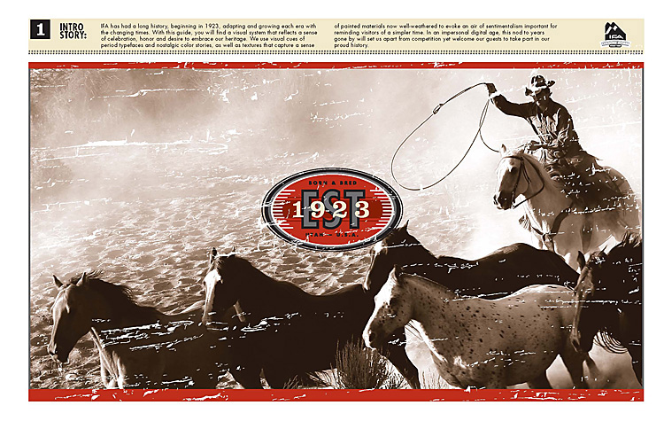
When deciding on the look & feel for the wayfinding system, we examined the long history IFA has had in its field, and how they've adapted and grown with each era of the changing times. In a new period of growth it seemed like an appropriate time to celebrate, honor and embrace their heritage by using the visual cues of period typefaces, color stories and natural materials to evoke an air of nostalgia, reminding their visitors of IFA’s authentic 1923 roots and as a throwback to simpler times. In an impersonal digital age, this nod to years gone by will set them apart from competition and welcome their guests to take part in their history.
In developing the overall store system, we looked for solutions that would carry out consistently across a multi-store platform and that would be straight-forward enough for each store’s staff to execute easily by following the Graphic Standards Guide we created.
One day we'll hitch the wagon to the horses and make our way over the mountains to Ogden to photograph the final outcome within the store. Until then, we'll just have to munch on the grass from this side of the mountains knowing that folks are navigating their way easily through the barn.